Tarva BXD · LumosIndex › Components › Overlays · 1
1920 × 1080 · Landscape
 Index › Components › Overlays · 1
1 of 2 · Overlays
Index › Components › Overlays · 1
1 of 2 · Overlays
Components · Overlays · 1
Layered above.
Seven ways Lumos floats content over the page — modal dialogs, edge drawers, sheets, and quiet popovers. The page dims, the panel rests on white, and accent waits for the one true action.
DialogshowCloseButton
Confirm booking
Your facial is held for 10 minutes.
Cancel
Confirm
Centered modal on a dimmed, blurred overlay.
max-w-lg, rounded-lg, showCloseButton on by default — accent rides only the confirm CTA.Alert DialogAction · Cancel
Delete this record?
This action cannot be undone.
Cancel
Continue
Interruptive confirm — no close button.
Cancel is outline, Action takes buttonVariants(). Destructive intent renders rust, not accent.Drawerside · state · width
Edit profile
Saved & verified
Save changes
Side panel —
side right/left, width 400 default. state success/warning/danger/info/neutral paints a status glow + dot (moss here, never accent).Sheetside · top·bottom·left·right
Filters
Narrow the appointment list.
ResetApply
Four-direction slide-in —
side top·bottom·left·right (default right), w-3/4 sm:max-w-sm. hideCloseButton off by default; left-anchored here.Full Screen Sheetopen · title · headerActions
Edit entry
Save
Mobile full-viewport overlay — slides up from the bottom. Header pairs a close
X + title with optional headerActions (the Save CTA, right).Popoverclosed trigger · open content
Settings
Width 320 px
Dimensions
Apply
Closed
Trigger beside open Content — w-72, rounded-md, p-4. Click-to-open, positioned via align (center) + sideOffset 4.Hover Cardopen on hover · align · sideOffset
Booked with @avery this morning.
A
Avery Lindqvist
Lead esthetician · Lumos Studio. Joined 2023.
lumos.co/team/avery
Reveals on hover, not click — a quiet preview over a dashed link.
w-64, rounded-md, p-4; same align + sideOffset 4 as Popover.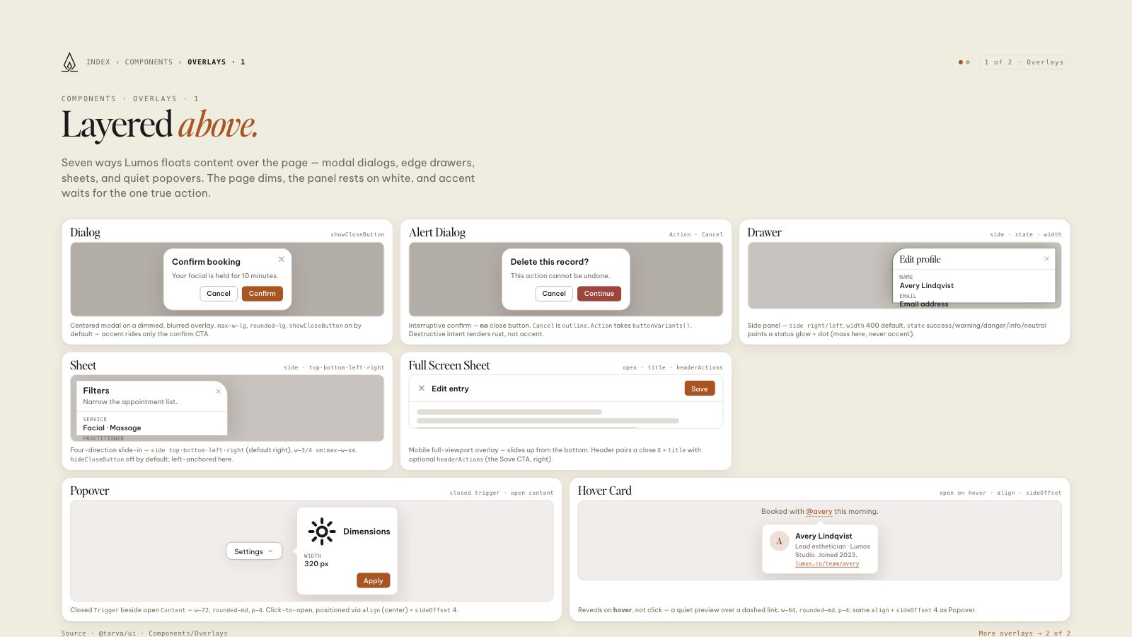
8.5 × 11 · Portrait