 Index › Components › Card
2 of 2 · Density, states & API
Index › Components › Card
2 of 2 · Density, states & API
One chrome, many densities.
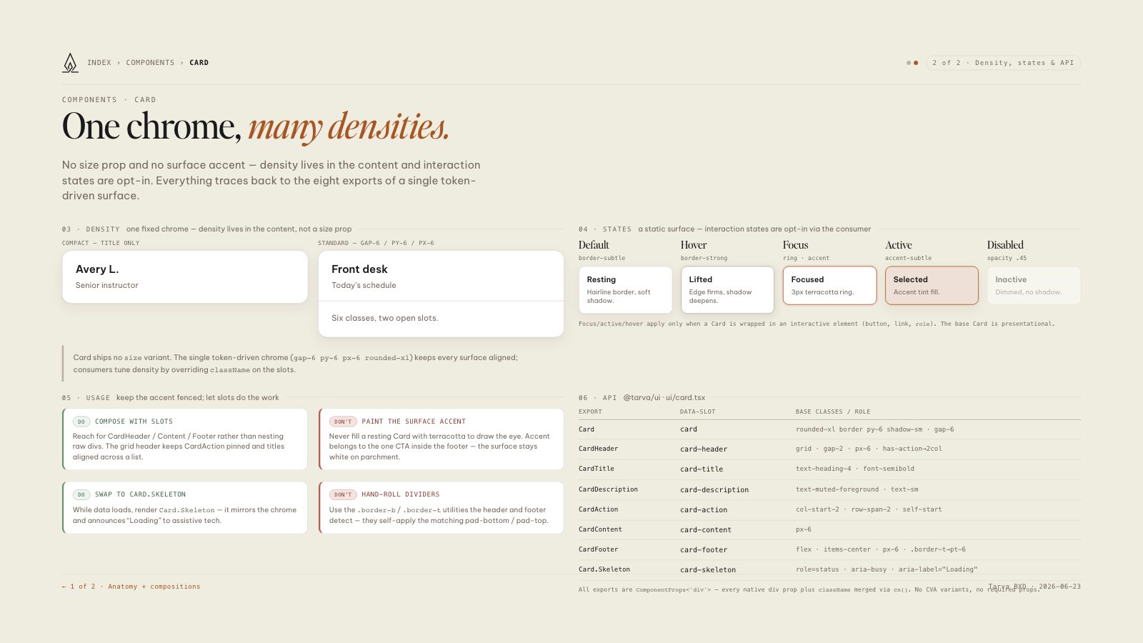
No size prop and no surface accent — density lives in the content and interaction states are opt-in. Everything traces back to the eight exports of a single token-driven surface.
Card ships no size variant. The single token-driven chrome (gap-6 py-6 px-6 rounded-xl) keeps every surface aligned; consumers tune density by overriding className on the slots.
role). The base Card is presentational.Reach for CardHeader / Content / Footer rather than nesting raw divs. The grid header keeps CardAction pinned and titles aligned across a list.
Never fill a resting Card with terracotta to draw the eye. Accent belongs to the one CTA inside the footer — the surface stays white on parchment.
While data loads, render Card.Skeleton — it mirrors the chrome and announces “Loading” to assistive tech.
Use the .border-b / .border-t utilities the header and footer detect — they self-apply the matching pad-bottom / pad-top.
| Export | data-slot | Base classes / role |
|---|---|---|
| Card | card | rounded-xl border py-6 shadow-sm · gap-6 |
| CardHeader | card-header | grid · gap-2 · px-6 · has-action→2col |
| CardTitle | card-title | text-heading-4 · font-semibold |
| CardDescription | card-description | text-muted-foreground · text-sm |
| CardAction | card-action | col-start-2 · row-span-2 · self-start |
| CardContent | card-content | px-6 |
| CardFooter | card-footer | flex · items-center · px-6 · .border-t→pt-6 |
| Card.Skeleton | card-skeleton | role=status · aria-busy · aria-label="Loading" |
ComponentProps<'div'> — every native div prop plus className merged via cn(). No CVA variants, no required props.