Tarva BXD · LumosIndex › Components › Feedback · 1/2
1920 × 1080 · Landscape
 Index › Components › Feedback
1 of 2 · Feedback
Index › Components › Feedback
1 of 2 · Feedback
Components · Feedback
Quietly reassuring.
How Lumos tells a person where things stand — a notice, an empty shelf, a stalled fetch. This page covers the page-level states; spinners, progress, and notifications continue on page two. Status reads through icon and word first; color only ever confirms.
Alertvariant · fullBleed
Heads up
Your next aesthetics appointment is in 30 minutes.
Payment failed
The card on file was declined — update it to continue.
Banner notice.
variant default · destructive; fullBleed toggles edge-to-edge. dismissible adds the trailing close. Destructive borrows the rust status hue — never accent.Empty Statesize sm · default · lg
No messages yet
When clients reach out, their notes land here.
Compose
Default
Inbox disc, title, description, optional action. Sizes sm · default · lg scale the disc. The action is a neutral outline button, not a CTA.Error Statesize · fullPage · onRetry
Something went wrong
An unexpected error occurred. Please try again.
Try again
Rust
AlertCircle disc. onRetry reveals an outline Try again with refresh glyph. fullPage reserves min-height; sizes mirror Empty State.Loading Statevariant · size
spinner
dots
skeleton · rows
Three layouts under one component:
variant spinner · dots · skeleton, sizes sm · default · lg. message labels the live region; skeleton takes a rows count.Inline Loadingstate · size
Saving…
Idle
Saved
Save failed
One persistent row that resolves:
active spins → success ✓ / error ✕; inactive dims. Shape + label both signal — color only confirms. size xs–xl.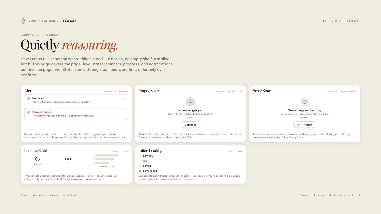
8.5 × 11 · Portrait