Tarva BXD · LumosIndex › Components › Input
1920 × 1080 · Landscape
 Index › Components › Input
Flagship · variants + states
Index › Components › Input
Flagship · variants + states
Components · Input
The input.
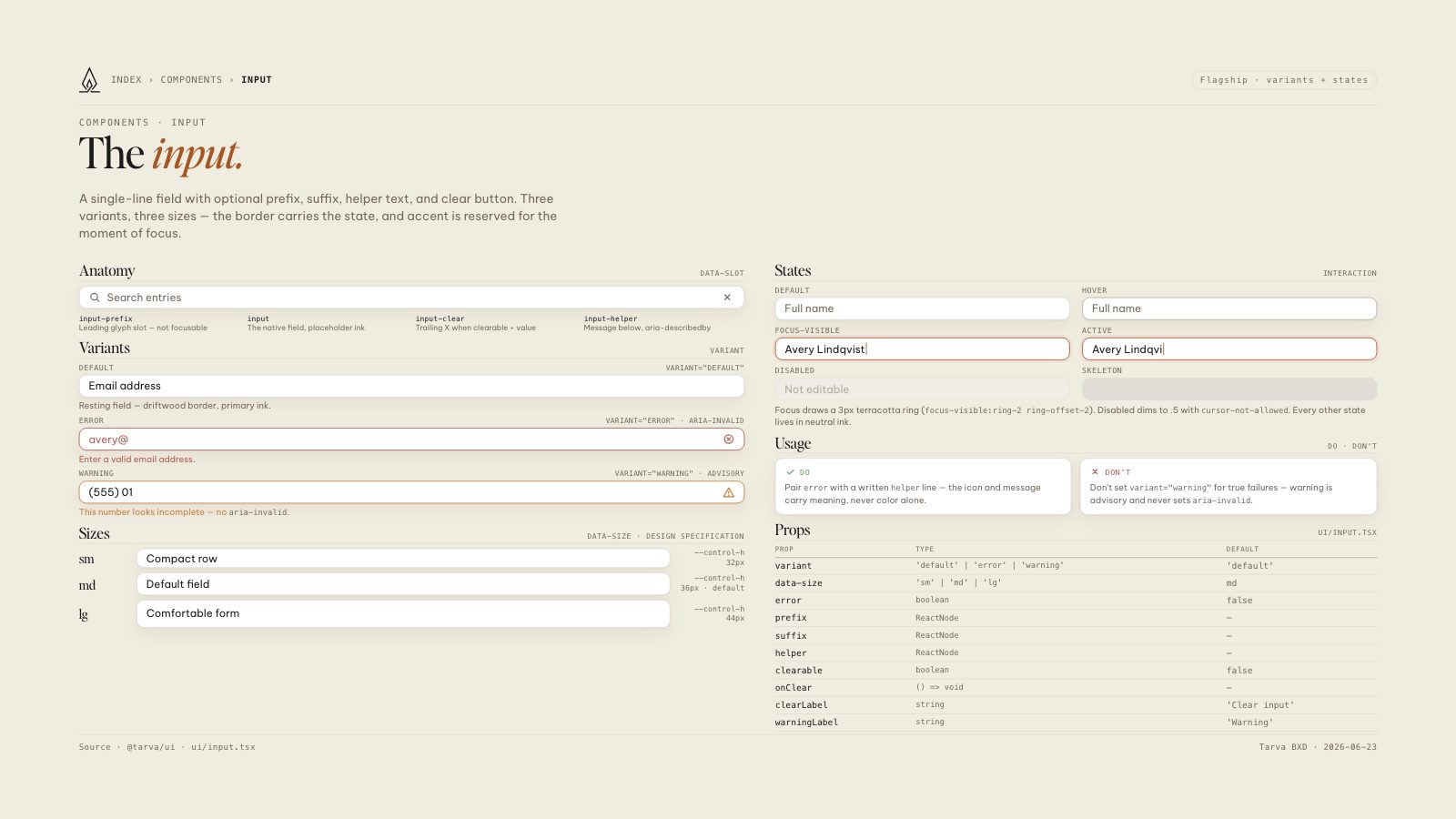
A single-line field with optional prefix, suffix, helper text, and clear button. Three variants, three sizes — the border carries the state, and accent is reserved for the moment of focus.
Anatomydata-slot
Search entries
input-prefixLeading glyph slot — not focusable
inputThe native field, placeholder ink
input-clearTrailing X when clearable + value
input-helperMessage below, aria-describedby
Variantsvariant
Defaultvariant="default"
Email address
Resting field — driftwood border, primary ink.
Errorvariant="error" · aria-invalid
avery@
Enter a valid email address.
Warningvariant="warning" · advisory
(555) 01
This number looks incomplete — no aria-invalid.
Sizesdata-size · design specification
sm
32px
Compact row
--control-h32px
md
36px · default
Default field
--control-h36px · default
lg
44px
Comfortable form
--control-h44px
Statesinteraction
Default
Full name
Hover
Full name
Focus-visible
Avery Lindqvist
Active
Avery Lindqvi
Disabled
Not editable
Skeleton
focus-visible:ring-2 ring-offset-2). Disabled dims to .5 with cursor-not-allowed. Every other state lives in neutral ink.
Usagedo · don't
Do
Pair error with a written helper line — the icon and message carry meaning, never color alone.
Don't
Don't set variant="warning" for true failures — warning is advisory and never sets aria-invalid.
Propsui/input.tsx
| Prop | Type | Default |
|---|---|---|
| variant | 'default' | 'error' | 'warning' | 'default' |
| data-size | 'sm' | 'md' | 'lg' | md |
| error | boolean | false |
| prefix | ReactNode | — |
| suffix | ReactNode | — |
| helper | ReactNode | — |
| clearable | boolean | false |
| onClear | () => void | — |
| clearLabel | string | 'Clear input' |
| warningLabel | string | 'Warning' |
8.5 × 11 · Portrait