 Index › Layout & Shell › Sidebar
nav + grouped nav
Index › Layout & Shell › Sidebar
nav + grouped nav
The navigation rail.
The persistent rail that holds a product's primary navigation — grouped sections, one active page, optional counts — that collapses from a 240-pixel column to a 60-pixel icon rail without losing its place.
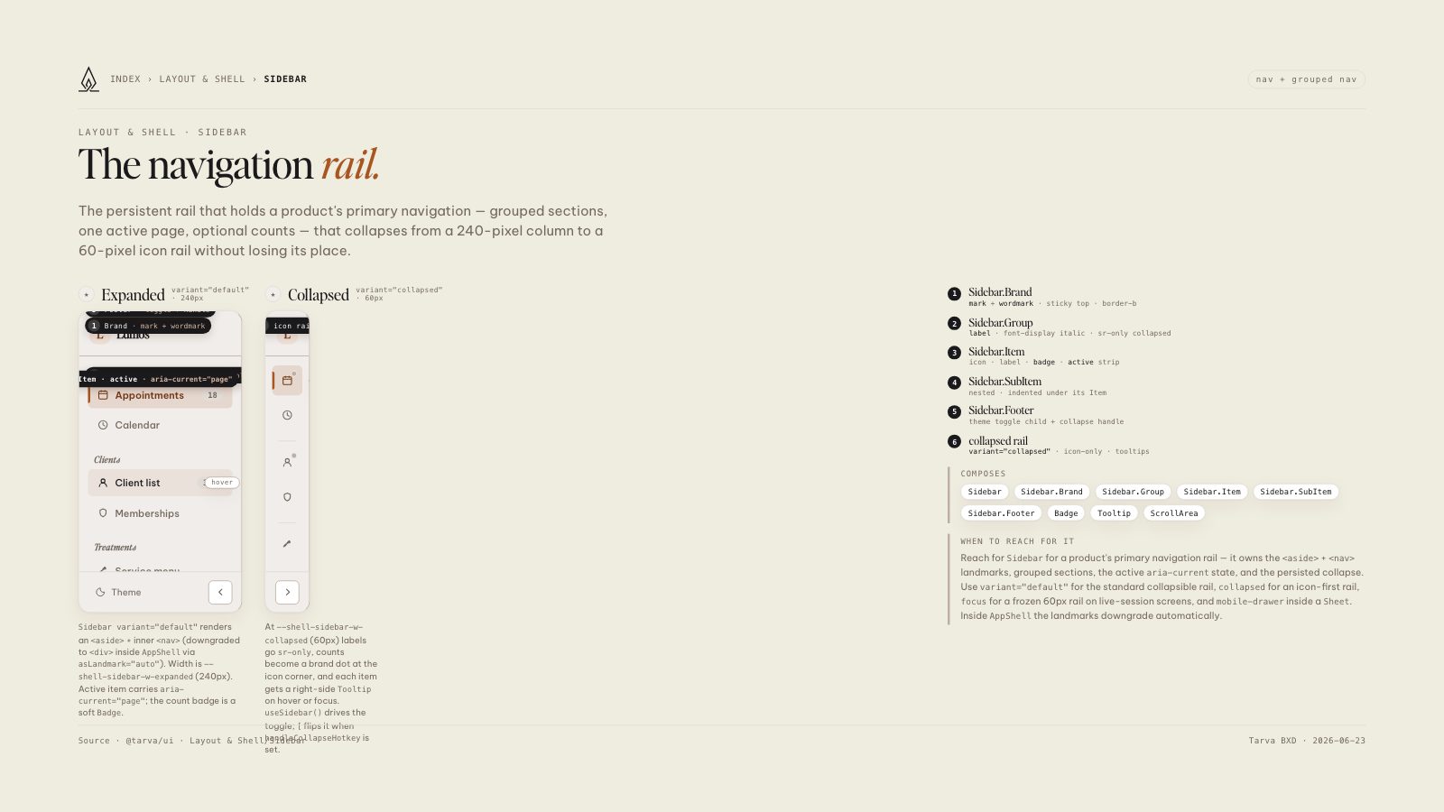
Sidebar variant="default" renders an <aside> + inner <nav> (downgraded to <div> inside AppShell via asLandmark="auto"). Width is --shell-sidebar-w-expanded (240px). Active item carries aria-current="page"; the count badge is a soft Badge.
At --shell-sidebar-w-collapsed (60px) labels go sr-only, counts become a brand dot at the icon corner, and each item gets a right-side Tooltip on hover or focus. useSidebar() drives the toggle; [ flips it when handleCollapseHotkey is set.
Reach for Sidebar for a product's primary navigation rail — it owns the <aside> + <nav> landmarks, grouped sections, the active aria-current state, and the persisted collapse. Use variant="default" for the standard collapsible rail, collapsed for an icon-first rail, focus for a frozen 60px rail on live-session screens, and mobile-drawer inside a Sheet. Inside AppShell the landmarks downgrade automatically.