 Index › Data Grid › The Grid
AG Grid + TanStack adapters
Index › Data Grid › The Grid
AG Grid + TanStack adapters
The whole table, assembled.
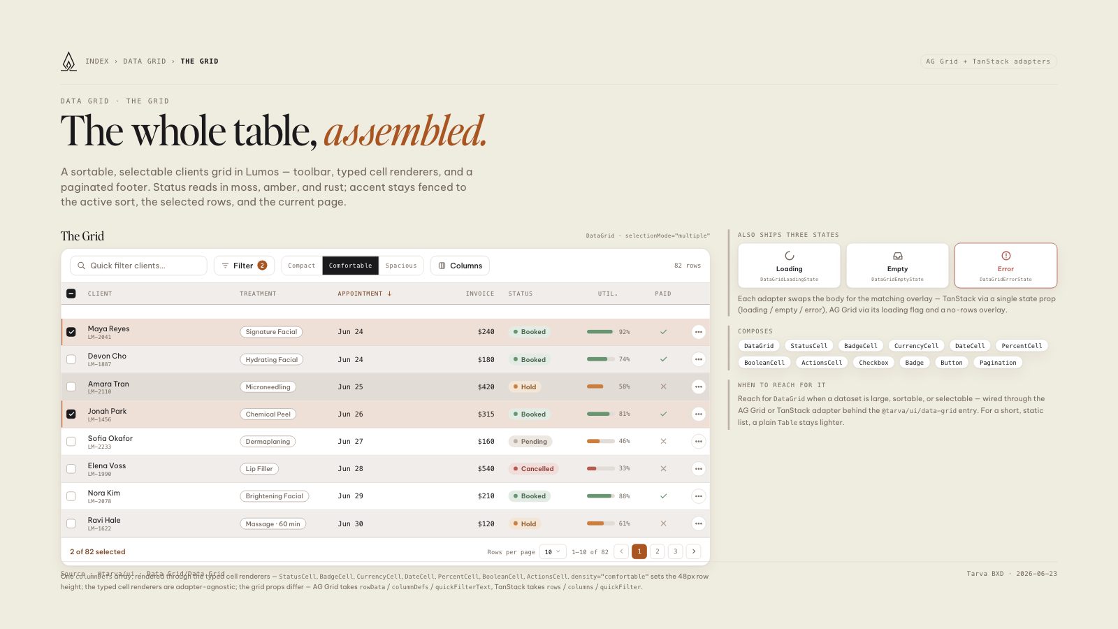
A sortable, selectable clients grid in Lumos — toolbar, typed cell renderers, and a paginated footer. Status reads in moss, amber, and rust; accent stays fenced to the active sort, the selected rows, and the current page.
One columnDefs array, rendered through the typed cell renderers — StatusCell, BadgeCell, CurrencyCell, DateCell, PercentCell, BooleanCell, ActionsCell. density="comfortable" sets the 48px row height; the typed cell renderers are adapter-agnostic; the grid props differ — AG Grid takes rowData / columnDefs / quickFilterText, TanStack takes rows / columns / quickFilter.
Each adapter swaps the body for the matching overlay — TanStack via a single state prop (loading / empty / error), AG Grid via its loading flag and a no-rows overlay.
Reach for DataGrid when a dataset is large, sortable, or selectable — wired through the AG Grid or TanStack adapter behind the @tarva/ui/data-grid entry. For a short, static list, a plain Table stays lighter.